

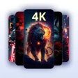
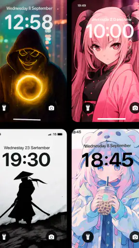
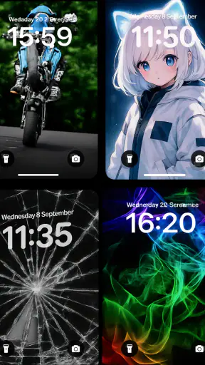
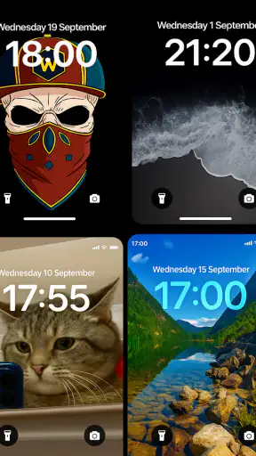
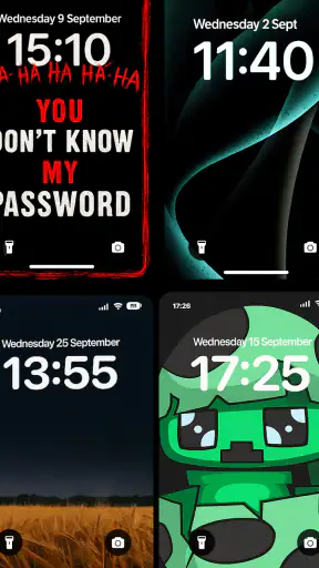
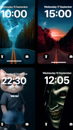
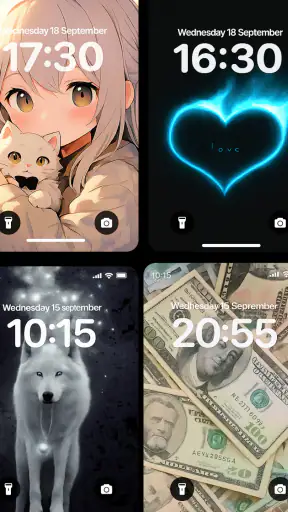
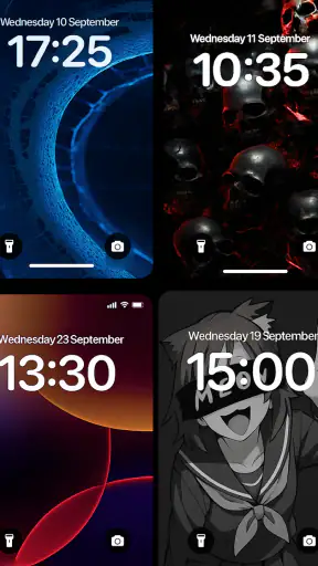
Changing a phone background sounds like a tiny adjustment, but it can change how the whole device feels every time I unlock it. Live Wallpapers 4K, HD, 3D is a personalization app from EAGLE APPS that focuses on animated backgrounds rather than a single still image. I tried it with that simple question in mind: does movement make the home screen feel more personal, or does it become visual noise after the novelty disappears?
My overall impression is that the app is most useful when I treat it as a mood-setting tool, not as a permanent source of spectacle. Its collection is aimed at people who enjoy animated phone backgrounds, with styles that include high-resolution scenes, zipper effects, smile-themed designs, anime-inspired visuals, fluid motion and live three-dimensional wallpaper. That variety gives the app a broader appeal than a basic wallpaper picker, although it also means the experience depends heavily on finding a style that suits your phone and your tolerance for movement.
What the live wallpaper capability actually changes
The main capability is straightforward: instead of placing a fixed picture behind app icons, the app lets me use a background with motion. That motion can make a screen feel more dynamic when I wake the phone, particularly when the design uses fluid shapes, depth or a small interactive-looking effect. The difference is easy to notice during the first few unlocks. A static image stays visually quiet, while a live background gives the home screen a little sense of activity.
That effect is strongest on a home screen where the wallpaper is not hidden under widgets and icons. When I use a busy layout with several rows of shortcuts, the animation becomes secondary and sometimes difficult to appreciate. With fewer icons and a clean arrangement, the background has room to contribute to the appearance of the device. This is an important practical distinction: the app cannot make a cluttered home screen look organized by itself, but it can make a deliberately simple one feel more finished.
The collection’s range also changes who might enjoy it. A person who likes colorful anime artwork will probably approach the app differently from someone looking for calm fluid motion. The zipper and smile-oriented styles are more playful, while the three-dimensional and high-resolution options aim for a stronger visual impression. I found that choosing by mood worked better than choosing by technical label. “Live” is not automatically better; the right background is the one that remains pleasant after repeated exposure.
For me, the most valuable part of the concept is the ability to give different phones a distinct personality without redesigning the entire interface. I can keep the same launcher, icons and widgets while changing the atmosphere behind them. That makes the app more accessible than a full customization suite, especially for someone who wants a visible change without learning a complicated theme system.
Using it without making the screen harder to read
The first thing I pay attention to is contrast. A dramatic background can look impressive in a preview but become inconvenient once white app labels sit over bright areas. I prefer placing a more detailed live design on a home screen with fewer icons, or selecting a scene whose main movement stays away from the area where my most-used shortcuts appear. This small adjustment makes the background feel intentional instead of distracting.
I also avoid judging a wallpaper only from its thumbnail. A still preview cannot fully communicate how the motion will feel during repeated unlocks. Some designs are attractive because of a short visual transition, while others work better as a slow, continuous backdrop. I give each candidate enough time to appear behind my normal apps and widgets before deciding. That is a more reliable test than selecting the most eye-catching preview immediately.
Another useful habit is matching the background to the phone’s purpose. On a personal device used for music, messaging and social apps, a bold anime or colorful 3D design can fit naturally. On a phone used for work, navigation or reading, a restrained fluid style is less likely to compete with information. The app offers the choice, but the quality of the result comes from how carefully I make that choice.
How the experience fits into everyday use
A realistic example is my morning routine. I unlock the phone to check messages, glance at the calendar and start a playlist. With a static image, the wallpaper disappears from my attention almost immediately. With a live design, I notice the motion during those brief pauses between tasks. That can make the device feel more enjoyable, but it does not make those tasks faster. The benefit is emotional and visual rather than functional.
Later, when I am looking for an app, readability matters more than animation. If the background has bright movement behind the icons, I may need a moment longer to distinguish labels. This is why I see the app as something to configure around my routine rather than something to leave entirely to its default presentation. A wallpaper that looks excellent during a relaxed preview may be a poor choice for a busy workday.
The app is free to install, which makes experimenting easy. There are in-app purchases ranging from $1.99 to $29.99 per item, so I would explore the free experience first and decide whether the extra visual options are worth paying for. I would not spend simply because a preview looks more elaborate. The practical question is whether I will still enjoy that particular style after seeing it many times a day.
Where it stands against ordinary wallpaper alternatives
The usual alternative is a still photograph, a personal picture or a wallpaper already included with the phone. Those options are calmer, generally easier to read and less likely to make the home screen feel busy. They are also better for someone who changes backgrounds rarely and wants the phone to remain visually stable.
A dedicated live wallpaper app offers more variety in motion and design, which is the reason to choose this one. Instead of searching manually for a suitable animated image, I can browse styles built around the live effect. The trade-off is that the result demands more attention during selection. With a normal photo, almost any clear image can work. With animation, speed, contrast and visual density matter just as much as the subject.
It also differs from a complete launcher or icon-pack system. Those tools can change the structure and controls of the interface, while this app concentrates on the background. I like that narrower approach when I want a quick visual refresh without replacing familiar navigation. If my goal were a fully coordinated theme with redesigned icons, widgets and gestures, I would look elsewhere rather than expect a wallpaper-focused app to do all of that.
The best scenario for this app
The strongest use case is a phone that feels visually dull but does not need a complete makeover. I can choose a fluid background for a calmer look, an anime design to reflect a personal interest, or a three-dimensional effect when I want the home screen to feel more dramatic. The change is immediate in perception, yet the rest of the device remains familiar.
It is also a good fit for people who use their phone as an extension of their style. Someone who changes accessories, lock-screen images or color themes may enjoy having motion as another way to express a preference. The app’s selection of zipper and smile-related designs makes it more playful than a collection limited to landscapes and abstract textures.
I would be more cautious about recommending it to someone who wants maximum battery discipline, a completely distraction-free interface or a very formal work phone. Animated backgrounds add visual activity even when I am not actively using the app. A static background is the safer choice for anyone who finds movement tiring or wants the home screen to disappear into the background.
Trade-offs I noticed during longer use
The biggest trade-off is novelty. A live wallpaper can feel special at first, but the same animation may become repetitive. I get better results by treating backgrounds as occasional changes rather than searching for one design that must remain perfect forever. Rotating between a few moods, when practical, keeps the feature feeling like personalization instead of permanent decoration.
Visual density is another limitation. High-resolution artwork and three-dimensional effects can look rich, but adding widgets, notification badges and many icons may produce a crowded screen. I often prefer a simpler background when I need to find information quickly. The most impressive option is not always the most usable option.
There is also a cost decision. Because the app is free, it is easy to try, but the presence of optional purchases means I would avoid assuming that every appealing design belongs to the no-cost portion. I would first identify the kind of motion I actually want, then consider whether paying for a specific item makes sense. That approach is more sensible than buying several designs before knowing which style suits my routine.
Compatibility is relatively approachable because the app supports Android devices running version 8.0 or later. That covers a wide range of phones, but the experience can still vary with screen size, launcher behavior and the general age of the device. I would install it on the phone I plan to use rather than assume that a preview reflects every handset equally. The app’s current version is 5.0.48, so keeping the installation updated is a sensible way to stay aligned with its present release.
Small decisions that improve the result
My first tip is to test readability with the phone in its normal state. I place the wallpaper behind the actual icon arrangement, not an empty preview screen. Then I check the first page, the page with the most widgets and the lock screen if I intend to use the design there. This catches problems that are easy to miss while browsing.
My second tip is to choose motion based on how often I unlock the phone. If I check the device constantly, a highly active design may become irritating even if it looks exciting. A slower fluid style is more forgiving for frequent use, while a bolder visual can work well on a secondary device or a phone I use mainly for entertainment.
My third tip is to protect the visual hierarchy. I keep the most important shortcuts in areas where the wallpaper is least complicated and avoid pairing a busy design with widgets that already contain dense information. This makes the live effect feel like a frame around the interface rather than another layer competing for attention.
My fourth tip is to judge the app by its specific styles instead of by the promise of 4K or 3D alone. Resolution and depth may attract me to a preview, but comfort, contrast and repetition determine whether I keep the wallpaper. For everyday use, a modest design that remains readable can be a better choice than the most technically dramatic one.
Who gets the most from it
I think the best audience is people who want a noticeable but uncomplicated personalization change. The app is especially suitable for users who enjoy animated visuals, anime artwork, playful effects or fluid backgrounds and who are willing to spend a few minutes selecting something that fits their layout. Its free entry point also makes it easy to explore before committing to any optional purchase.
It is less suitable for someone who wants a single quiet photograph, a fully redesigned interface or a tool centered on productivity. In those cases, the phone’s built-in wallpaper picker, a personal photo or a complete launcher may be a better match. I would also skip it if movement on the home screen feels distracting rather than enjoyable; no amount of visual variety fixes a mismatch in taste.
The app has reached over a million installs and holds a 4.3 average from around twenty-two thousand ratings, which suggests that its basic idea resonates with a sizeable Android audience. It is rated for Everyone, so the presentation is broadly accessible, but that does not mean every design will suit every age, personality or working environment. The important choice happens after installation: selecting a background that supports the way I use the phone.
My recommendation after using it
Live Wallpapers 4K, HD, 3D is a worthwhile free personalization app when the goal is specifically to add motion and character to an Android home screen. I like its range because it lets me move between playful, artistic and more atmospheric styles without changing the rest of the interface. The live effect can make an ordinary unlock feel more personal, especially when the icons and widgets are arranged with enough space for the background to breathe.
I would not recommend installing it simply because a moving wallpaper sounds impressive. The real test is whether the animation remains comfortable, readable and enjoyable during a normal day. Start with the free options, check the design behind your actual icons, and be selective about purchases. The best result comes from treating motion as a carefully chosen accent, not as decoration everywhere.
For someone who wants a calm, efficient screen, a still image remains the better answer. For someone who wants the phone to show a little more personality each time it wakes, this app gives that change without forcing a complete customization project. That balance is where I think EAGLE APPS has made the strongest case for it.


